2019 Acura RDX: How controversial Can a Touchpad Interface in a Car Be?
Acura has quite a challenge ahead if it wishes to convince us that its True Touchpad Interface can do better than a more traditional multimedia interface...
People who consult The Car Guide regularly already know what we think of Lexus’s own in-car touchpad interface. It’s clumsy, veering on the dangerous. The past few years, we were not really more impressed by Honda and Acura’s split-screen setup, which made controlling the radio or the navigation system almost as hazardous as that ineffable touchpad.
- Also: 2018 Lexus NX: When Technology Generates More Distraction Than it can Solve
- Also: 2019 Acura RDX: Some Personality at Last!
Good news: Honda has reacted to the criticism, swapping its dual screens for a more classic interface in most of its newer Honda models. The Acura brand, on the other hand, starting with the 2019 RDX, now offers... a touchpad.
A Touchpad with a Twist
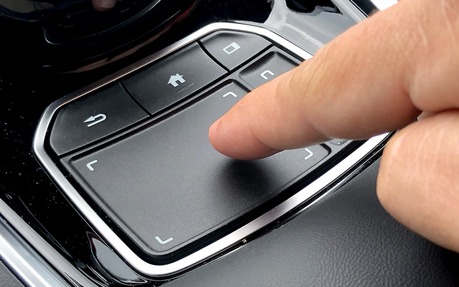
Aware that interacting with a touch surface while driving sometimes is a challenge, Acura tweaked its own technology to make it more intuitive. Like the larger horizontal display it controls, the touchpad is divided in two areas, the larger one also being divided in eight separate zones representing the applications and shortcuts displayed on screen.
No need to move a cursor with your finger; simply tap the proper zone on the pad to highlight or access the application of your choice. It can be customized in many different ways, by summoning apps (navigation, phone calls, etc.) and shortcuts (home phone number, audio source, etc.) to your liking.
The second, smaller display accesses the info contained in those same apps. You only need to swipe a finger on the pad to move from one app to the next. The same goes with your phone’s interface (Apple CarPlay and Android Auto), if you connect it to the system via USB.
Are touch surfaces that necessary?
The RDX is a small luxury SUV, the hottest segment of the Canadian vehicle market right now. For 2019, Acura has redesigned everything. It looks good, and has more oomph, thanks for a very smart turbocharged powertrain.
On its steering wheel, the RDX also features Acura’s more traditional commands, including a scroll wheel and an Apps button (that allows the drive to customize the optional head-up display). These are very effective and easy to use.
Acura also improved its voice command system, even though it’s still way more limited than Siri or Google’s Assistant, which can be accessed via their own, USB-powered interfaces.
In total, there are three different ways to interact with the RDX’s multimedia system, two of which require a bit more patience or accuracy than is sometimes available while driving and looking at the road ahead.
This situation is not exclusive to the Acura RDX. Most of the industry’s multimedia interfaces are uselessly redundant and clumsy. Mazda and Mercedes-Benz’s newer systems are arguably two of the best, and GM has recently simplified its own system, which is quite an improvement for the American carmaker.
Honda and Acura seem focused on improving their own system, which is good. Getting rid of the dual-screen setup was a smart move. Opting for a touchpad is debatable, but at least, it’s a tap of the finger in the right direction...
