Porsche’s Iconic Crest Could Have Looked Way Different and Pretty Strange
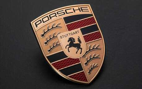
Porsche is celebrating its 75th anniversary this year and decided to make slight revisions to its iconic crest for the first time in 15 years and the sixth since the original debuted in 1952 (Porsche lettering was used on cars during the first four years).
It could have looked way different from the one we know, mind you.
- Also: Porsche Vision 357 Speedster is a Refreshing Homage to 356
- Also: Inside Porsche's 75th Anniversary Celebration in Stuttgart
As early as 1951, Dr Ottomar Domnick, one of the very first avowed Porsche fans, launched The Porsche Prize, a competition to find a logo for the new brand. However, none of the various designs submitted fit the bill. Then, at a business dinner in New York at the end of 1951, Max Hoffman spoke with Ferry Porsche and revived the idea of designing a logo.

Ultimately, designer Franz Xaver Reimspieß, who also created the Mercedes-Benz star and Volkswagen logo, had this idea of combining a rearing horse, taken from the seal of the city of Stuttgart, with the traditional crest of Württemberg-Hohenzollern.
There were a few problems, however. In the 1950s, colour printing was still very expensive, and also rather complicated. Creating a clear, sharp graphic or image without the print screen slipping was tricky, and the crest didn’t look nearly as elegant as a stark black-and-white version. Moreover, Porsche’s head of advertising, Hermann Lapper, complained in 1961 that “the different colours and many details as a whole do not amount to a compact, coherent visual effect in road traffic.”
And so, a variety of designs were created in collaboration with Hanns Lohrer, a commercial artist who was responsible for many influential posters and advertisements at Porsche in the fifties and sixties. Nothing came of this, though.

Pictured above are five of the rejected proposals. One was just a tilted black 'P' with its reflection creating an arrow-like design. Most others either were based on a circle or used a combination of black, red and gold, which have become Porsche’s signature colours.
The strangest logo is arguably the one that look like a mask—some will say from an African tribe, a Transformers or even Ironman. Can you imagine this on a modern 911 or Taycan? Clearly Porsche made the right move by sticking with the original crest.
