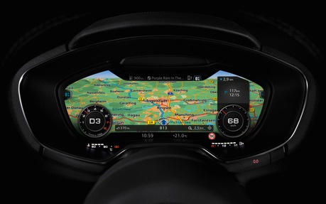
Audi’s Virtual Cockpit Demystified
A few days ago, during our first test of the 2017 Audi A3, we got the chance to catch up with Christoph Ullrich of Audi’s electrical and electronic department.
The Audi virtual cockpit, an entirely digital information system projected in high definition directly in front of the driver, first appeared last year in the 2016 Audi TT. The gauges move around, depending on the data transmitted by the system. This information is perfectly clear and easy to understand and use. In some ways, Audi’s system is similar to Ford’s SYNC 3.
This virtual cockpit, or VC, has just made its way into the Technik trim level of the 2017 Audi A3. The A4, Q7 and R8 will be next later this year. And, in the next couple of years at the most, the entire Audi lineup will have it.
The same, but different
We learned from Christoph Ullrich that even though the interface remains identical, or almost, the programming of the VC in the A3 is very different from that of the A4. Strangely, it’s all about the engine. The transverse engines (in the Audi TT, A3 and Q3) don’t have the same “dictionary” of codes as longitudinal ones. Thus, the programming has to be adapted.
The VC is an integral part of the Audi MMI system, which now has two buttons instead of four (one in each corner) as it did when it first appeared in the 2000s. In the past, Audi received numerous complaints from clients who had trouble using a four-button system. Now, using the MMI is more like using an iPhone, except that instead of sliding your finger from left to right to scroll through menus, the driver uses one of the two buttons (left-right). This arrangement is found on the central console and on the left branch of the steering wheel.
The central screen, which retracts when not in use (and is much nicer than Mercedes-Benz’s tablet-like screen, but is likely to cost a fortune to repair if it breaks), is not touch sensitive. And that’s just what they wanted, since every time a person touches a screen in a precise spot, he or she has to take his or her eyes off the road.
The top of the MMI’s dial is tactile. For example, in navigation mode, simply write the first two letters of a destination and the system will immediately generate a list. Previously, the MMI’s dial could do that too, but it could ask you for up to three or four letters before offering a choice. A great deal of work was also done to improve the voice recognition software.
There are four types of Audi’s MMI: MMI Radio, MMI Radio Plus, MMI Nav and MMI Nav Plus. Owners of an Audi equipped with MMI Radio Plus can make their system an MMI Nav Plus with just a simple upgrade.
The future is now
We asked Ullrich if Audi plans on developing a gesture recognition system soon, like Mercedes-Benz and BMW. For now, it’s not in the works. Audi believes that the interpretation of required gestures is still too vague and too many of these gestures look alike. Maybe Audi is working on this type of system in secret—but if that’s the case, Ullrich isn’t letting on.
In his opinion, the Audi virtual cockpit shouldn’t undergo any major changes over the next few years. Sure, Audi will make improvements to it, but they should be relatively minor. Ullrich says he’d be surprised if they had to add information to the current offer, but he’s already aware that it should be more personalized to reflect individual needs and tastes.
At any rate, after test driving it on totally unknown roads around Munich, Germany, I can confirm that the VC is quite user-friendly, even after only a few minutes of familiarization. However, as with all systems like this one, I imagine that most people will find two or three screen layouts that they like and stick with them. As with any system, only a fraction of its capabilities will be used. I do the same thing with my brain.
